What a blurred background is for
Blur creates depth and hierarchy: what is sharp draws the eye, what is blurred falls back. On a story, it is ideal for laying readable text over a busy image without the whole thing turning to mush.

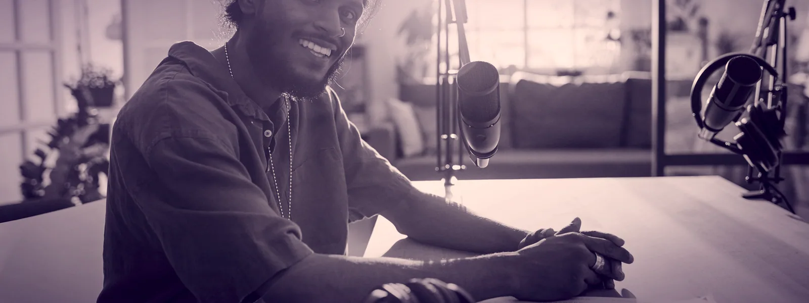
A blurred background points the eye at what matters: your face, your product, your text. It is a simple trick that instantly makes your stories look more polished.
Blur creates depth and hierarchy: what is sharp draws the eye, what is blurred falls back. On a story, it is ideal for laying readable text over a busy image without the whole thing turning to mush.
Receive an access link by email. Confirm it to use the tools and read the full methods on this device for 30 days. No account or purchase is required.
Enough reading. Build it now.
Open the editor and apply this guide to your real Lynks page, for free. You learn by doing, not by reading.
Email access opens the tools. Your Lynks page brings together links, QR codes and analytics. Present your offers and portfolio, then choose the plan that fits your business.
Your page, profession by profession
Other guides